(Actual ponderances after the pictures. Promise.)
There is so, so much to be said for how the world and life are viewed through black-and-white or sepia. Sadly, this is not that kind of blog post.
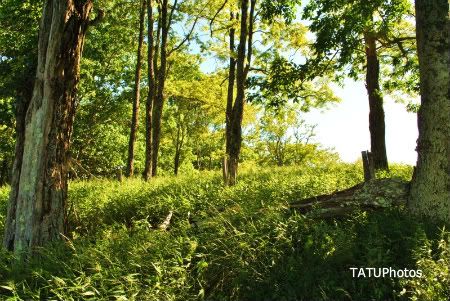
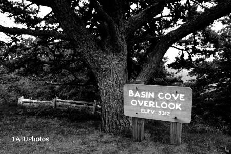
I wanted to mention briefly how relatively easy it is to make a "just okay" picture more interesting by converting it to a form of black-and-white. The first photo, for example, is just okay in color. I really only took it as a reminder later of where the batch of photos was taken along the Parkway.
By de-saturing it and then upping the contrast (a lot), however, to me it now has a certain gravity, even in its bleakness.
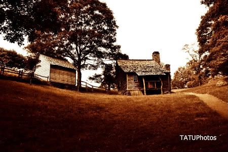
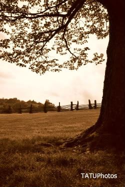
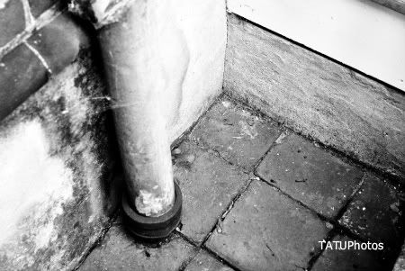
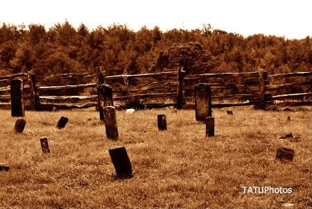
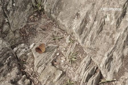
The Brinegar cabin, the cemetery, and the tree were taken in sepia mode in the camera, so here I just upped the contrast (to a lesser extent with the tree). The pipe and butterfly pictures were originally in color.
What's neat about the butterfly picture is that he was so bright, even with the photo almost completely de-saturated, his color survives somewhat. I didn't do much with the contrast in order to maintain this effect.
Most professional photographers agree, it seems, that the best way to create black-and-white photography is to take your photos in color, and then manipulate them in post-processing. Photo editors now give you tons of options and flexibility when converting to B&W, and there are of course many different shades and tones and presets to choose from. The argument is, if you start out with a B&W picture, there's really no place left to go - you're stuck with what the camera gave you, and there isn't much on-board choice.
I only used the rinky-dink Windows photo editor, because I haven't had the time to fully devote to learning how to use the B&W options in Adobe or GIMP. I still like the results, and God-willing, there'll be plenty of time in the future to devote to learning. =)